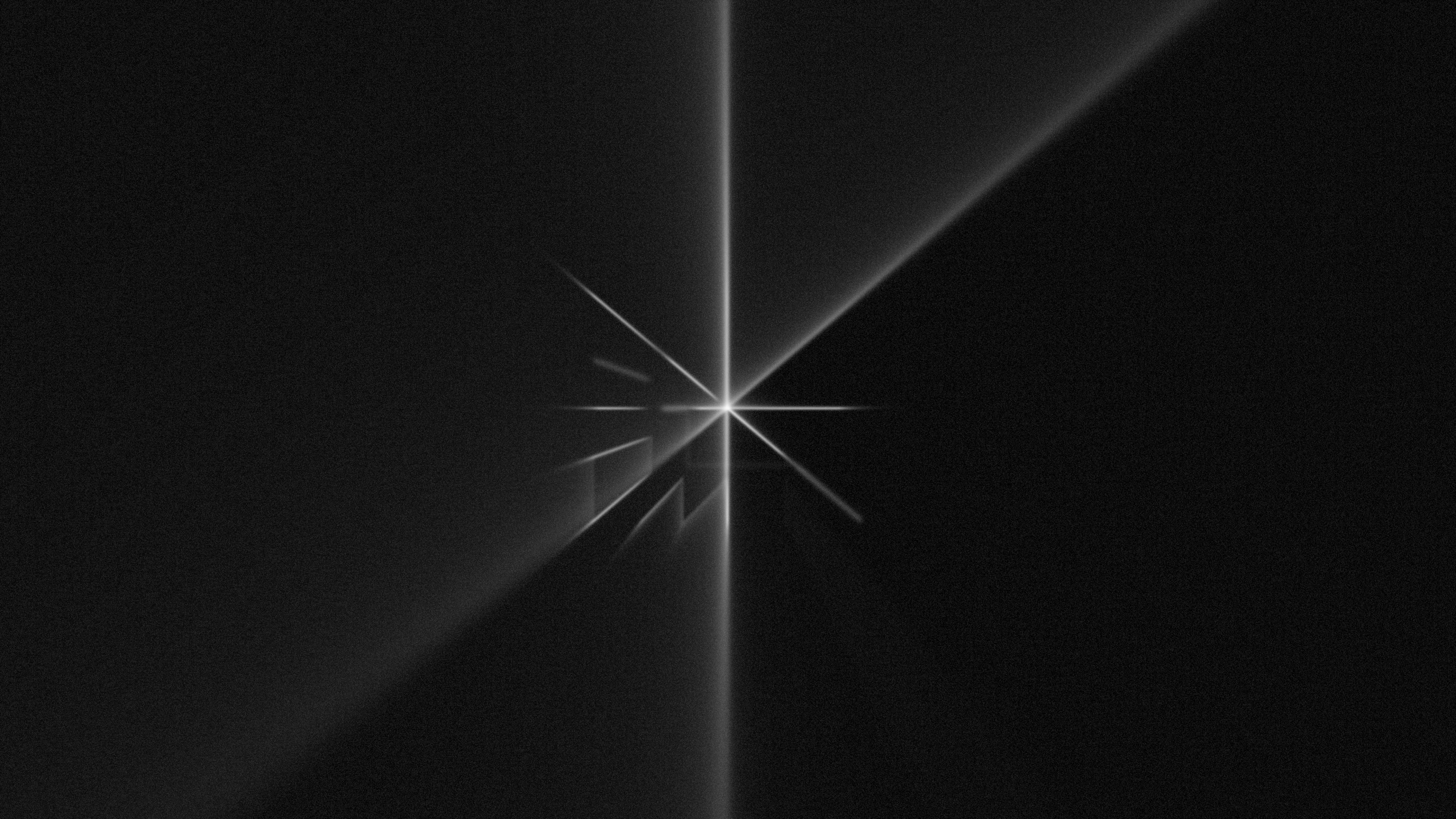
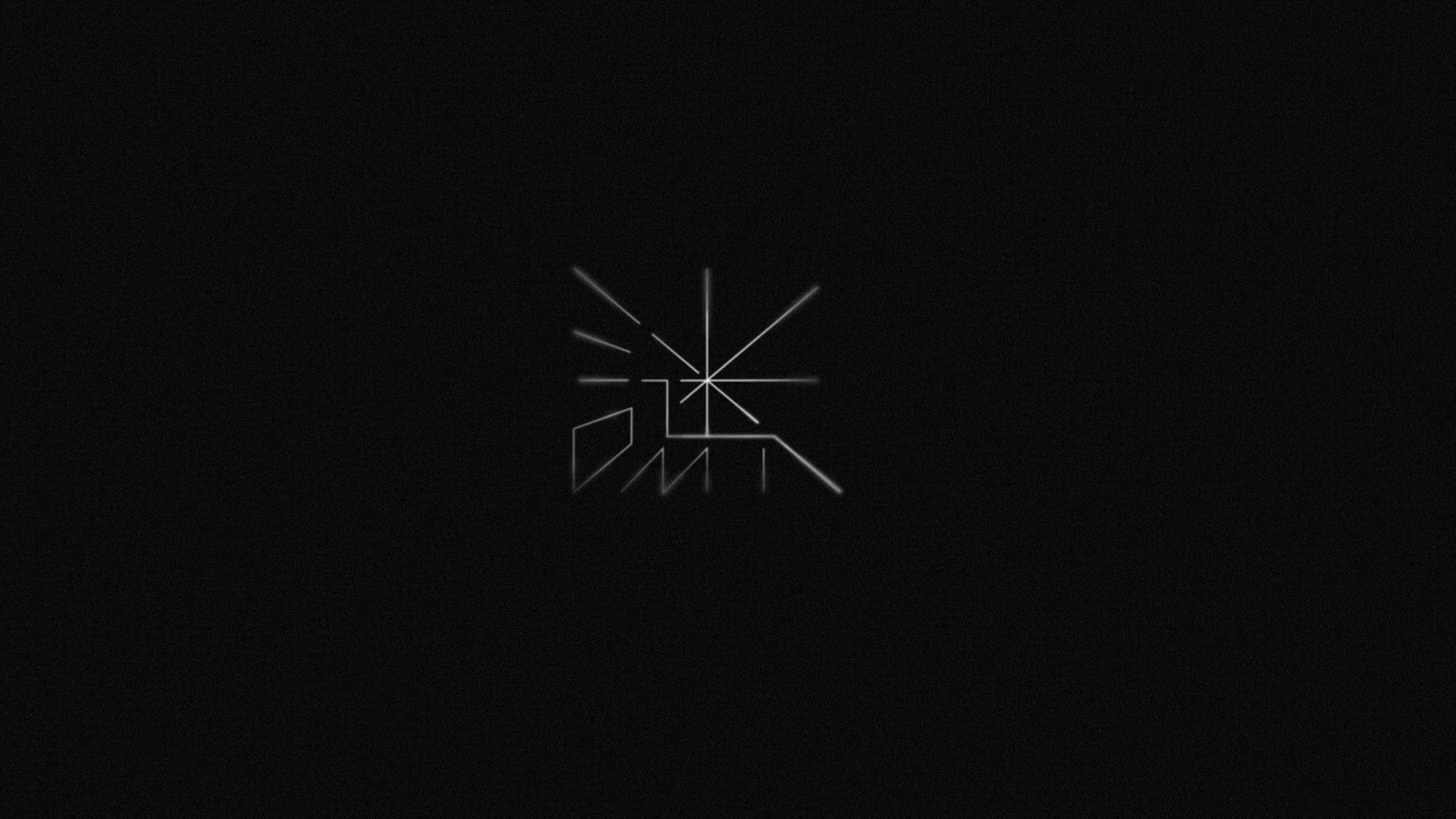
MI 謎 TYPEDESIGN CONCEPT
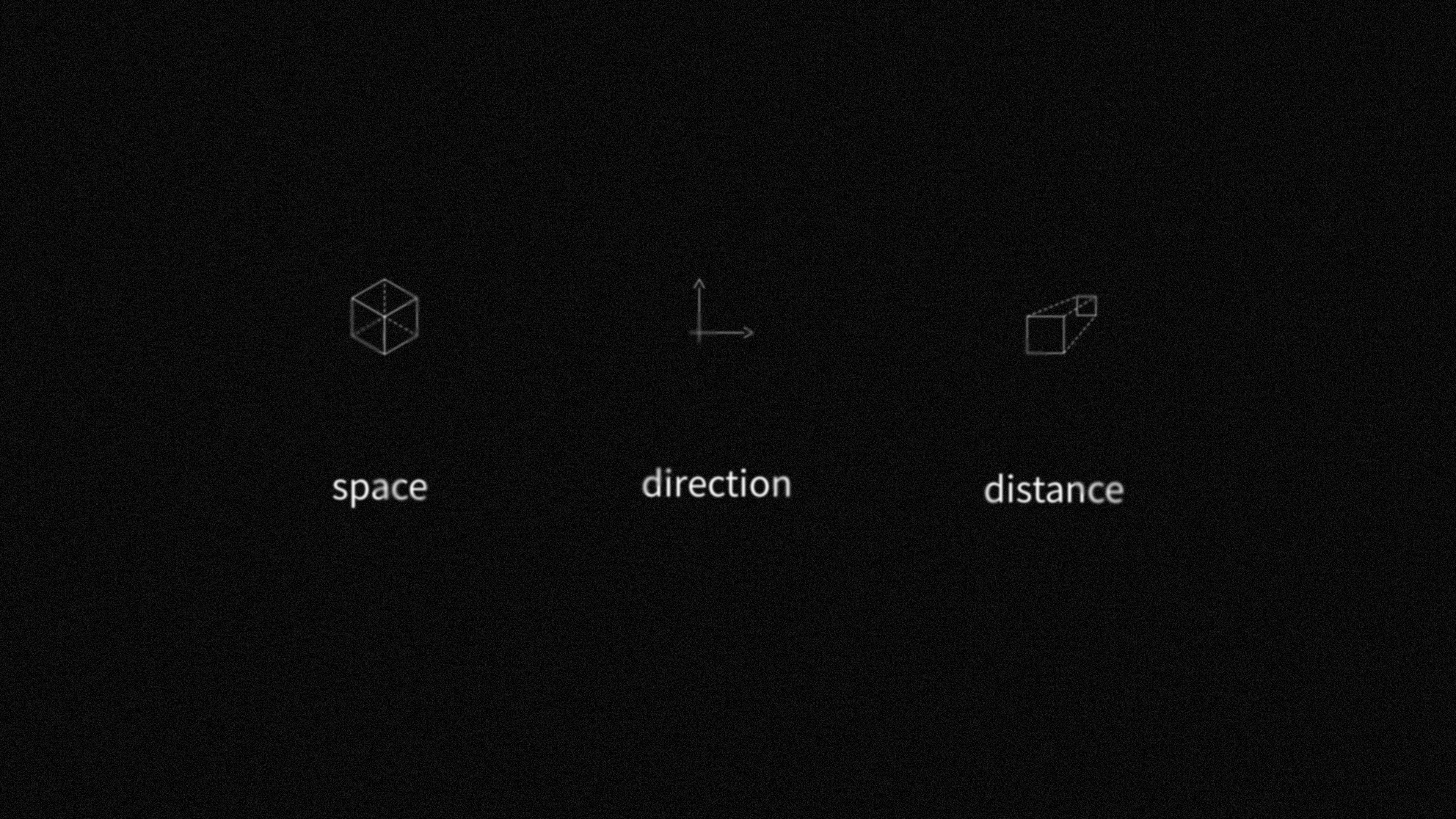
The concept of MI typeface are two elements which presented as space and direction. These two elements are shown as “one-point perspective” structure on the graphic. The film gives me the feeling of going forward in the mysterious space.

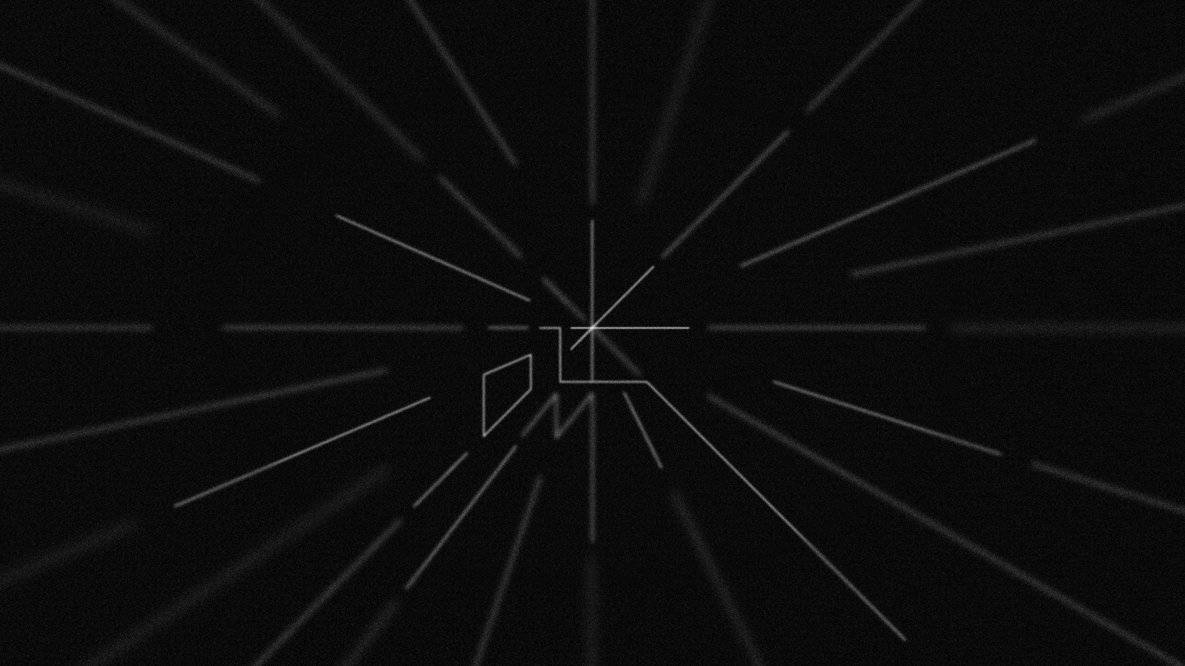
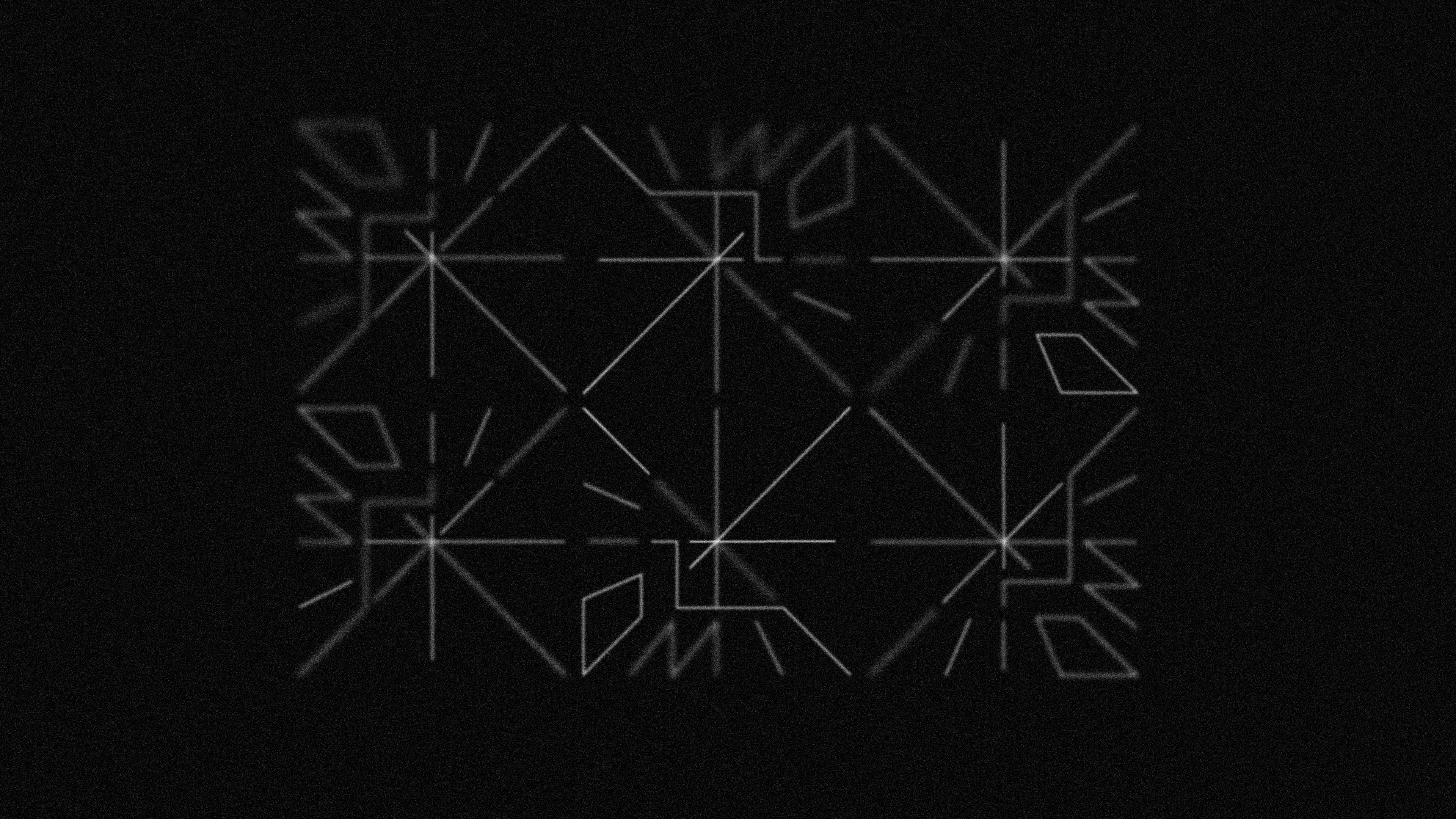
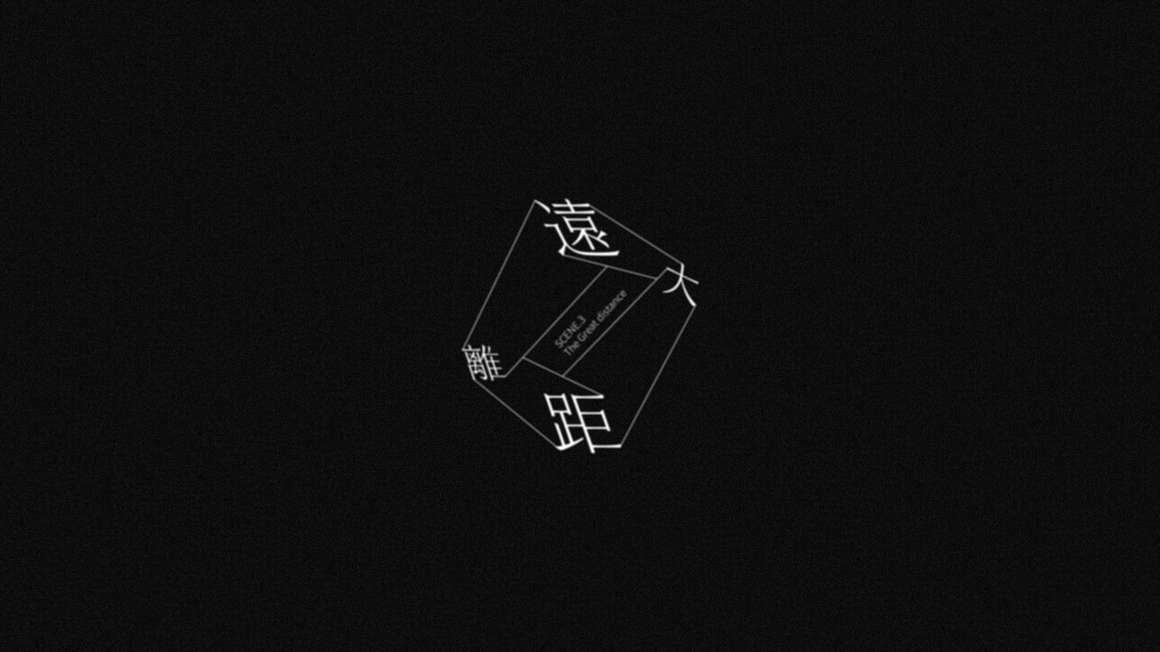
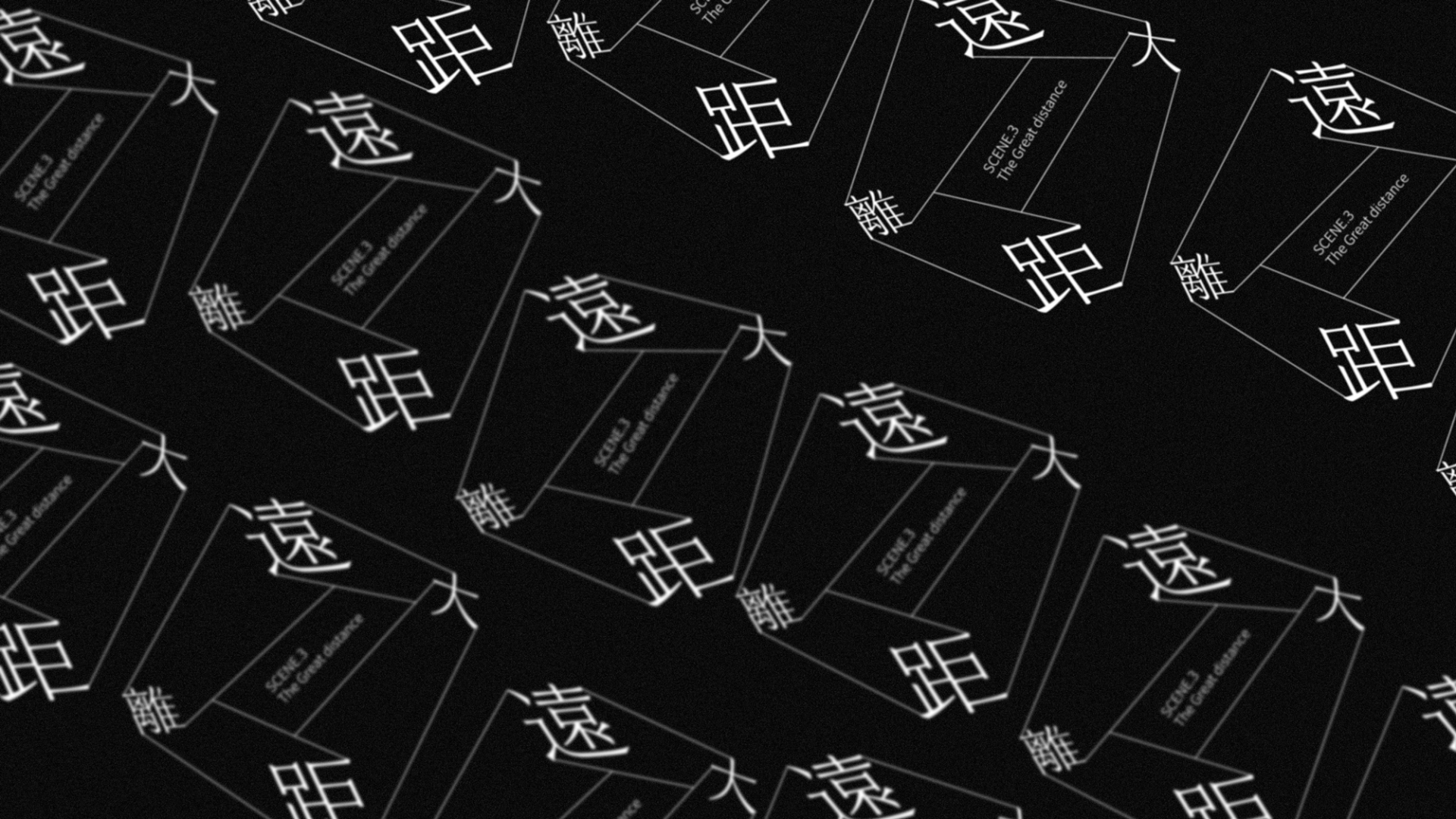
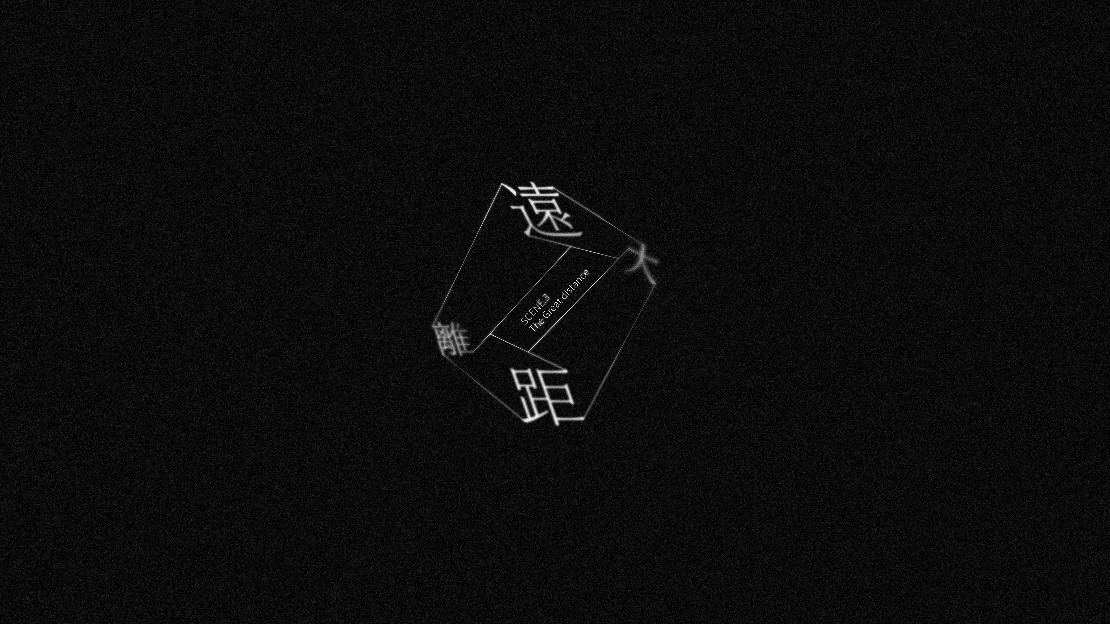
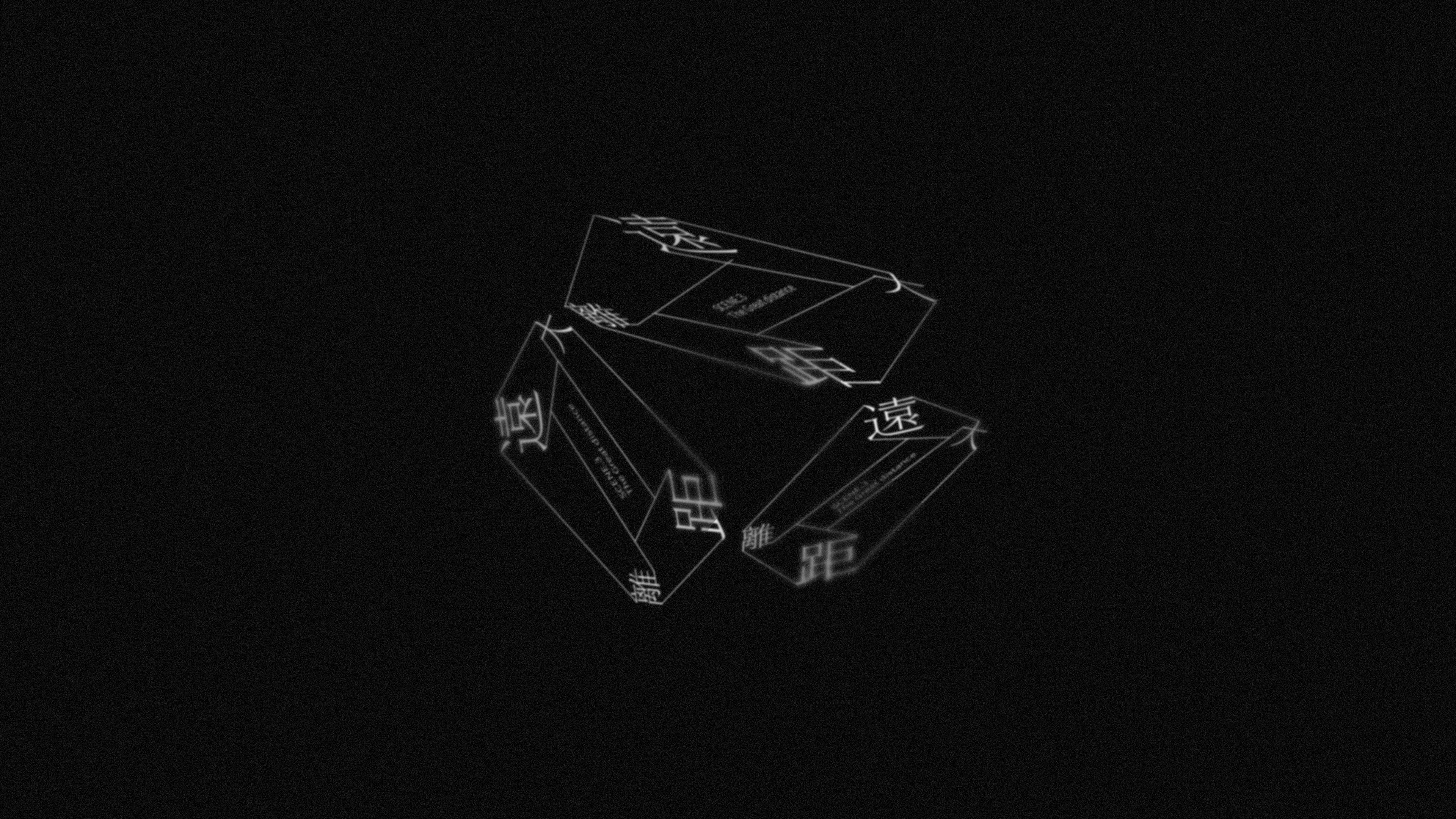
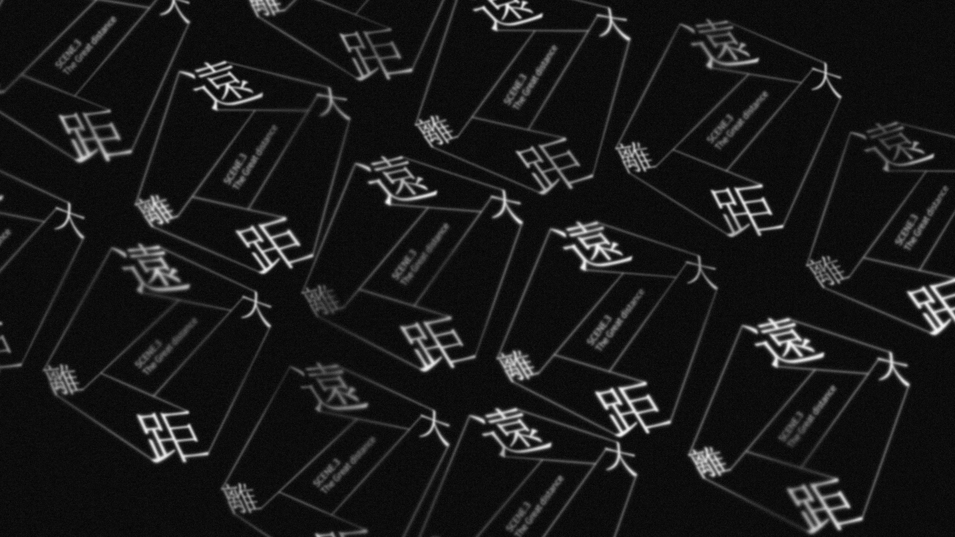
scene3.遠大距離 THE GREAT DISTANCE
The typeface is made by the 3d path and line connecting each others. The distance can be referred to the line which is built by two points. To match the film title ”maze” I make the different Chinese words connect each others and changing the path into 3d way. It shows the complicated and conflict feeling in the character’s mind.
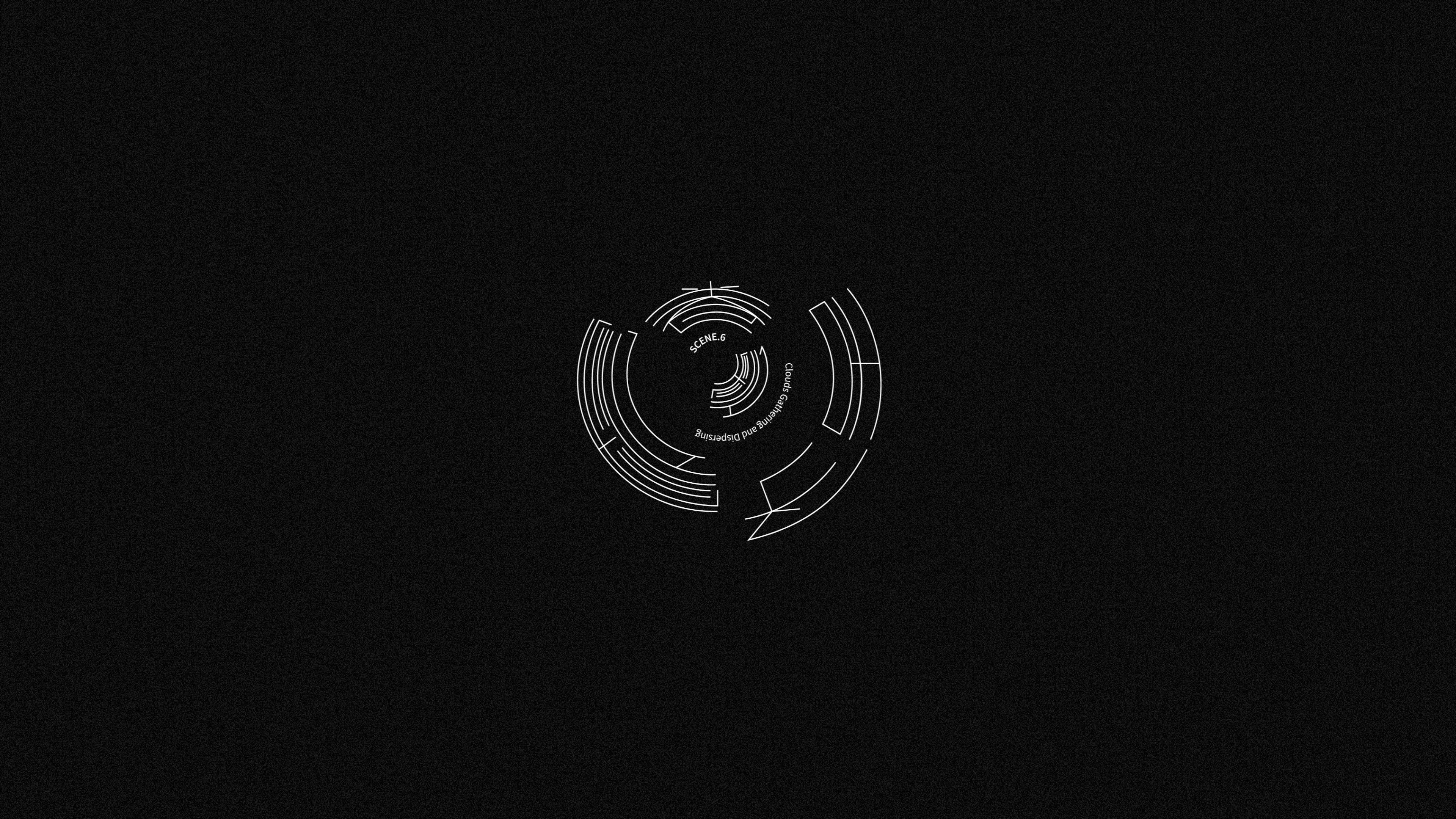
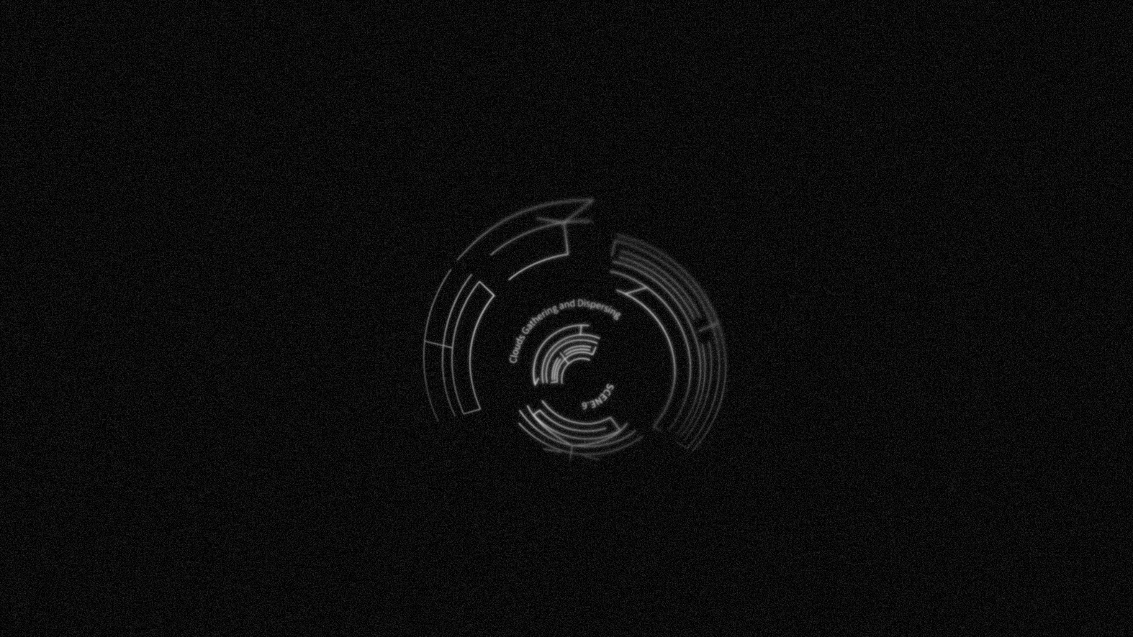
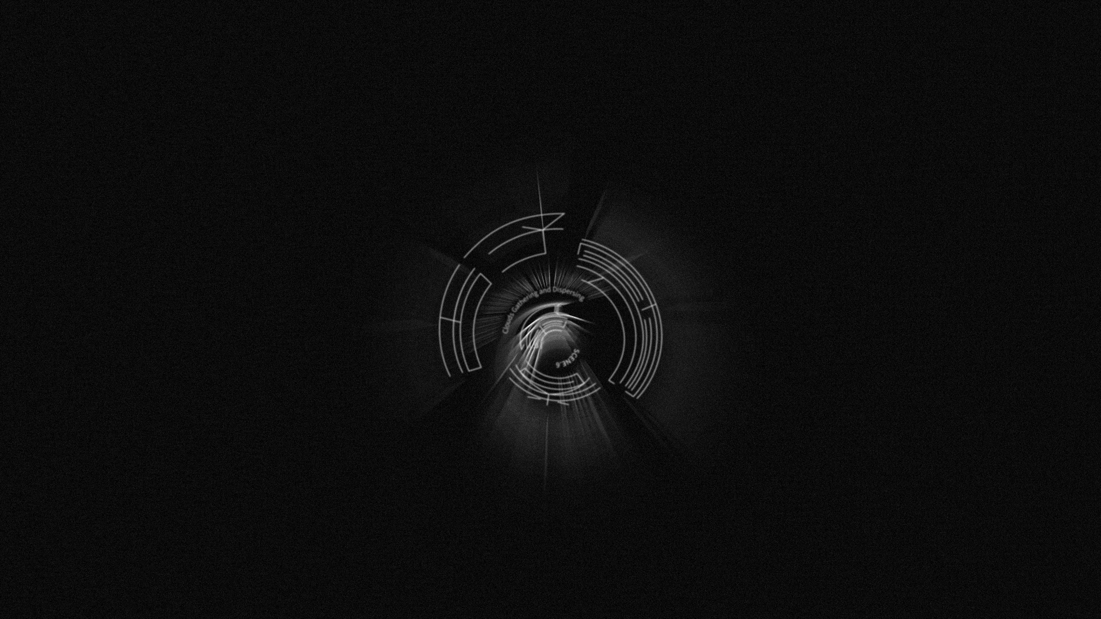
scene.6雲卷雲舒 Clouds Gathering and Dispersing
The typeface is made by the spiral path which shows the downward direction. The spiral lines swallow words by the invisible power which connected to the film. The order of these words are rotating by the spiral , so the viewer must rotate the words to read.


Design: Chieh-Ting Lee
Concept: Chieh-Ting Lee
Motion: Chieh-Ting Lee